AI can build web apps faster than ever. The hard part is making the result look like a product instead of a pile of individually generated screens.
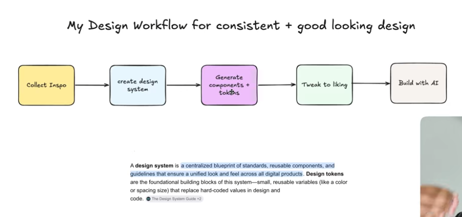
Rasmic's workflow is useful because it does not pretend AI has taste by default. The workflow gives the model structure: collect inspiration, create a design system, generate components and tokens, tweak the system until it feels right, then hand it to a coding agent.
The design system is the prompt. If the agent has no tokens, no component rules, and no reference language, it will invent a new product on every page.
Source note
Credit to Rasmic, also listed publicly as Michael Shimeles, a full-stack engineer who runs a software studio and AI consultancy and makes videos about AI, agentic engineering, and software development.
The video uses Mobbin as an inspiration source. Mobbin describes itself as a real-world design inspiration library with iOS, web apps, sites, screens, flows, UI elements, and searchable screenshot text. I also checked Material Design's design token guidance and Vercel's post on AI-powered prototyping with design systems, which both support the central point: models need structured design context.
Why AI UI breaks
The common failure mode in AI-built UI is not that the model cannot make a pretty screen. It can. The failure is that the second screen looks like it came from a different product.
One screen has pill buttons. Another has square cards. One dashboard uses soft shadows. The settings screen uses hard borders. The landing page has a playful brand voice. The app interior becomes generic SaaS gray. The pieces may be individually fine, but the product has no visual memory.
That is what design systems and tokens fix. A design system gives the agent the rules of the product. Tokens give those rules names it can reuse in code.
The five-step workflow
The workflow from the video is clean enough to turn into a repeatable builder process:
- Collect inspiration. Find examples that match the product feel, density, interaction style, and component types you want.
- Create a design system. Use a screenshot, design reference, or markdown design guide as the source material.
- Generate components and tokens. Ask the AI to produce colors, typography, spacing, radius, elevation, buttons, forms, badges, cards, dialogs, and states.
- Tweak to taste. Fix the system before you start building screens. Remove generic decorations, adjust alignment, and decide what the brand should not do.
- Build with AI. Send the design system into Claude Code, Codex, Cursor, or another coding agent and ask for screens that obey the system.
This is the important shift: the agent should not begin by designing the app. It should begin by understanding the design language.
Collect better inspiration
Rasmic suggests collecting inspiration from X bookmarks, personal screenshots, and Mobbin. In the video he uses Family.co as a visual reference because the site has a playful, polished, product-specific feel.
The right way to use inspiration is not to clone the page. Use it to identify decisions:
- How dense is the layout?
- How rounded are cards and buttons?
- How playful is the motion?
- What is the type scale?
- How are success, warning, danger, and info states handled?
- Are shadows soft, sharp, absent, or replaced by borders?
- What do empty states, dialogs, forms, tabs, and badges look like?
That is the part most AI prompts skip. They jump straight to "make it modern." Modern is not a system. It is a fog machine.
Create the design system
In the video, Rasmic screenshots the reference page, sends it into Claude Design, and asks it to create a design system on one page. That design system includes colors, typography, spacing, radius, semantic states, and example components.
He also shows another path: use a design markdown file, such as a design-system reference from Vercel's design resources, as the base layer. The practical idea is the same: give the AI a system before asking it for screens.
Vercel makes this point directly in its own AI prototyping writing: for models to produce interfaces that feel right, they need to understand components, behavior, structure, and how the pieces work together. That is why the design system becomes context, not decoration.
Use tokens and components
Design tokens are named decisions. Instead of scattering #2563eb, 16px, and 12px radius everywhere, you give decisions names like:
color.brand.primary
color.surface.default
color.intent.success
spacing.md
radius.card
shadow.soft
type.heading.lg
Material Design describes design tokens as a way to point to style values such as color, fonts, and measurements instead of hardcoding values. In practical AI terms, tokens stop the model from improvising new values every time it creates a new component.
A useful design-system page for AI should include:
- Color palette with semantic names.
- Typography scale and font choices.
- Spacing scale.
- Radius scale.
- Elevation and border rules.
- Buttons with variants and states.
- Inputs, selects, textareas, and validation states.
- Cards, badges, dialogs, alerts, menus, tabs, and tooltips.
- Light and dark mode examples if the product needs both.
Build with AI
Once the design system is tuned, Rasmic sends it into Claude Code and asks it to build a landing page, auth page, and dashboard. That is the right order. The coding agent is no longer inventing a UI from scratch. It is implementing a grammar.
This also works with Codex, Cursor, v0, or another coding agent. The rule stays the same:
- Do not ask for 12 screens before you have a system.
- Do not fix visual inconsistencies one component at a time after the build.
- Do not let the agent introduce random hex values, one-off spacing, or brand-new button styles.
- Do give it tokens, components, states, examples, and "do not do this" boundaries.
The best AI UI workflow is not less design work. It is design work moved earlier, where one correction improves every later screen.
Prompt pack
Here is a practical version of the workflow you can reuse.
1. Generate the design system
Please create a design system from the attached reference.

Use the reference for visual direction, not for direct copying.
Create a one-page design system that includes:
- color tokens
- semantic color roles
- typography scale
- spacing scale
- radius scale
- elevation and border rules
- buttons
- badges
- inputs
- cards
- dialogs
- forms
- alerts
- tabs
- tooltips
- loading and empty states

Also include a short "rules for future screens" section.
2. Tighten the taste
Review this design system like a senior product designer.

Find anything that looks generic, inconsistent, overdecorated, or too AI-generated.
Suggest specific changes to improve:
- visual hierarchy
- spacing
- component consistency
- button and form states
- dark mode readiness
- accessibility contrast
- brand distinctiveness

Keep the system practical for a coding agent to implement.
3. Build screens from the system
Build the landing page, sign-in/sign-up page, and dashboard using the design system already in this project.

Rules:
- Use existing tokens instead of new hardcoded values.
- Reuse components before creating new ones.
- Keep page density, radius, spacing, and typography consistent.
- Include hover, focus, loading, empty, and error states where relevant.
- After building, audit the screens for design-system violations and fix them.
4. Add polish without breaking the system
Add tasteful micro-interactions to the existing components.

Do not change the design language.
Use the existing token values for color, radius, spacing, and motion.
Prefer subtle transitions, hover feedback, and state clarity over decorative animation.
List every component you changed and why.
Builder checklist
Before you let an AI agent build UI, check these boxes:
- You have 3 to 10 reference screenshots or flows.
- You know what you are borrowing: density, component behavior, tone, motion, or layout structure.
- You have a design-system page or markdown file.
- You have named tokens for colors, spacing, type, radius, and states.
- You have core components before full screens.
- You have tuned the system before handing it to the coding agent.
- You have asked the agent to audit its own output against the system.
- You have checked mobile, dark mode, keyboard focus, loading states, and text overflow.
Before asking AI to build the app, make it learn the visual language: references, tokens, components, states, and the rules that keep every screen feeling like the same product.
Sources
- Rasmic: Building beautiful UI using AI workflow
- Rasmic link page
- Michael Shimeles / Ras Mic site
- Mobbin design inspiration library
- Family.co reference site used in the video
- Material Design: design tokens
- Vercel: AI-powered prototyping with design systems
- Vercel Design
- shadcn/ui
- Claude Code
- Claude
The short version: AI UI improves when you stop asking for beautiful screens and start giving the model a reusable design system. Taste still matters. The trick is putting that taste into tokens, components, and rules the agent can follow.